The Problem
Inflexible Template
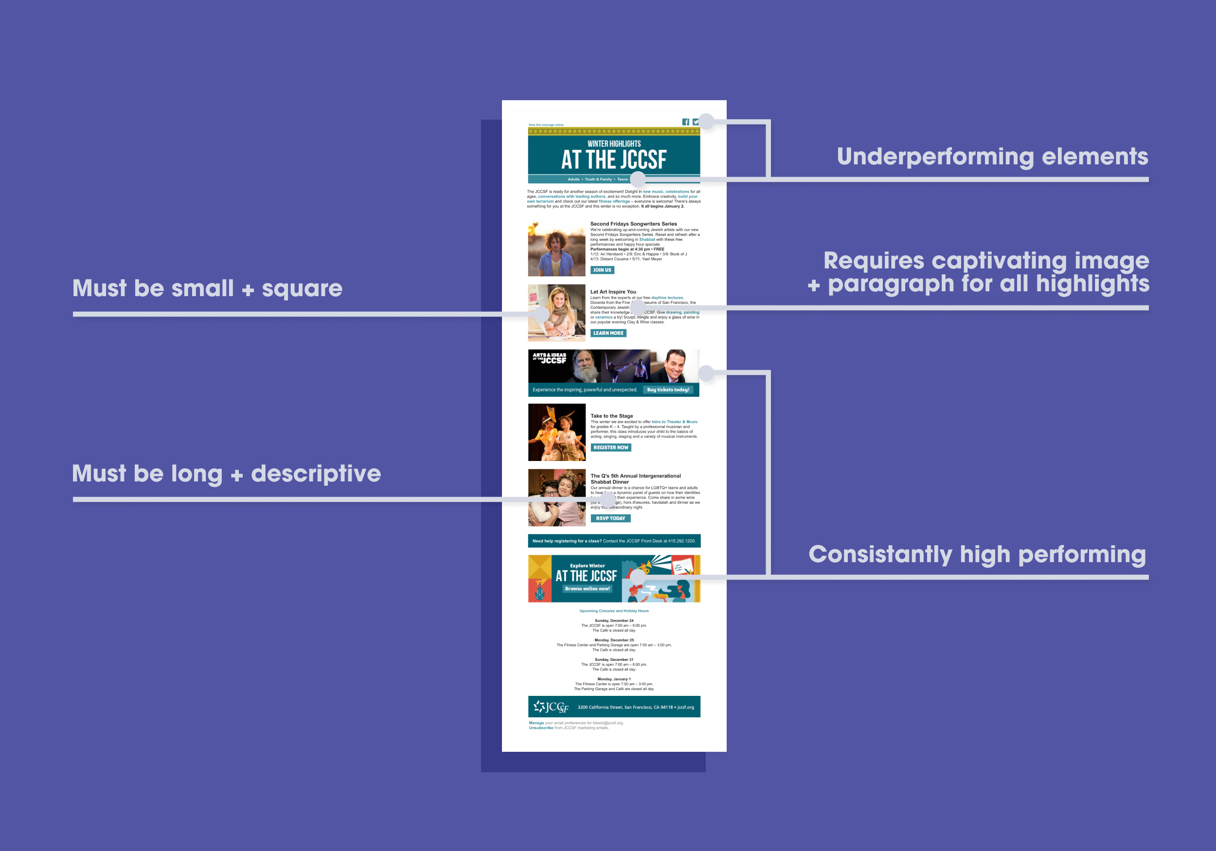
Regardless of whether or not we had compelling copy or photos, each listing required a square image with a paragraph. Due to this rigidity, sometimes a unique event was marketed poorly because the creative assets fell short.
Inefficient to Build
The original templates required lots of copywriting and endless image searching, placing a burden on the short-staffed team.
Underperforming Components
Another key focus of my research was identifying underperforming components. Pinpointing these elements brought focus to testing new solutions.
The Solution
Fluid Template
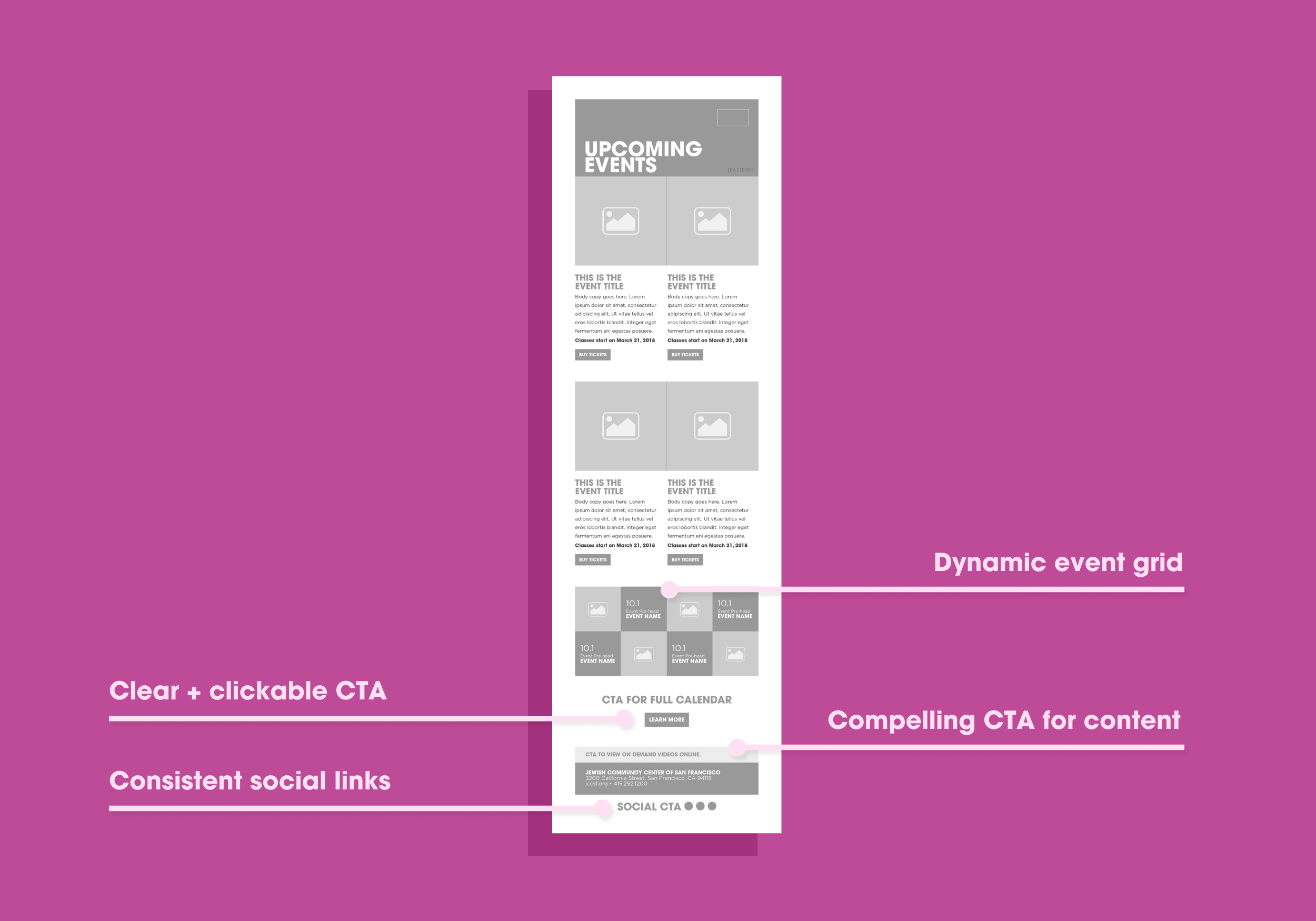
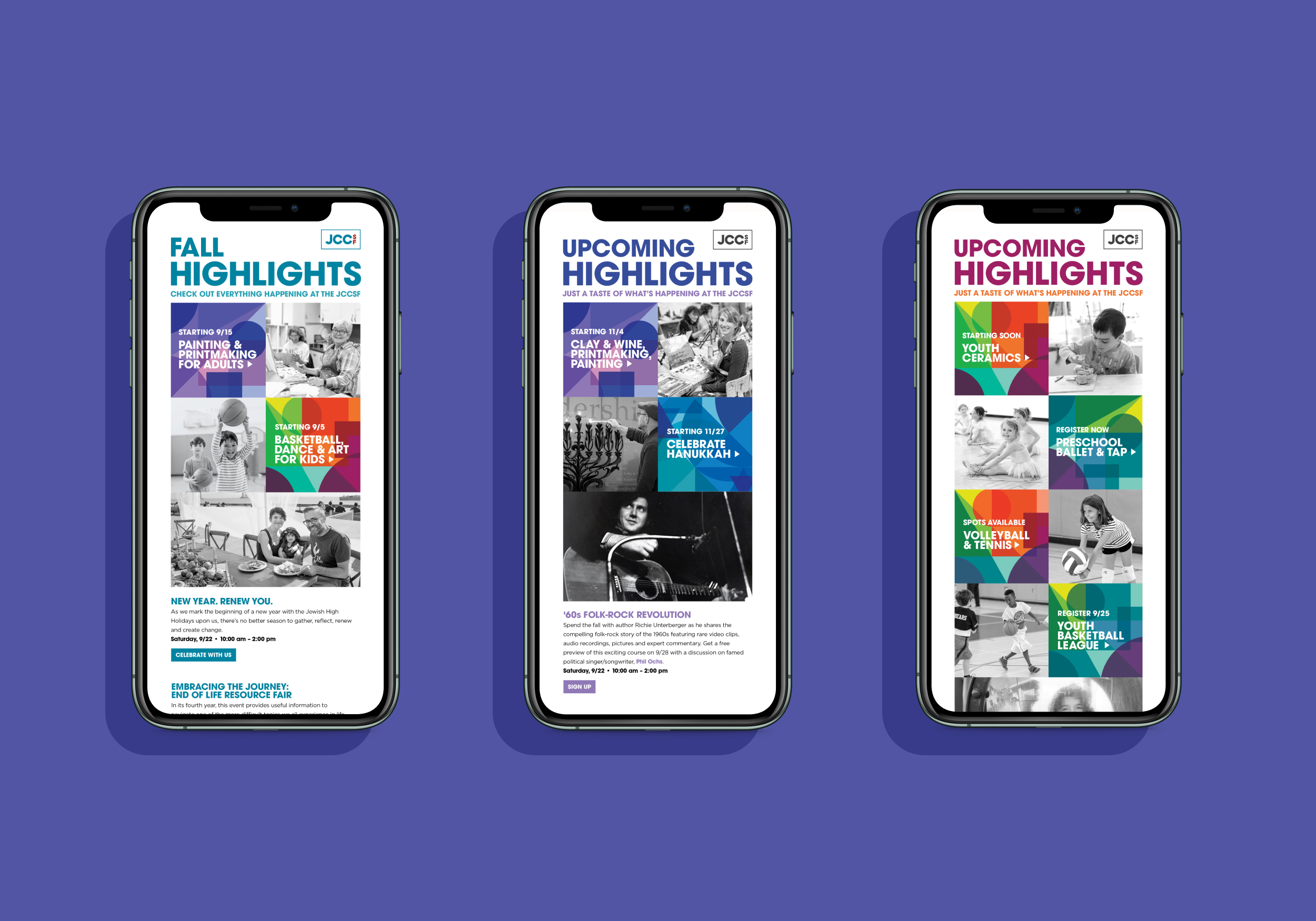
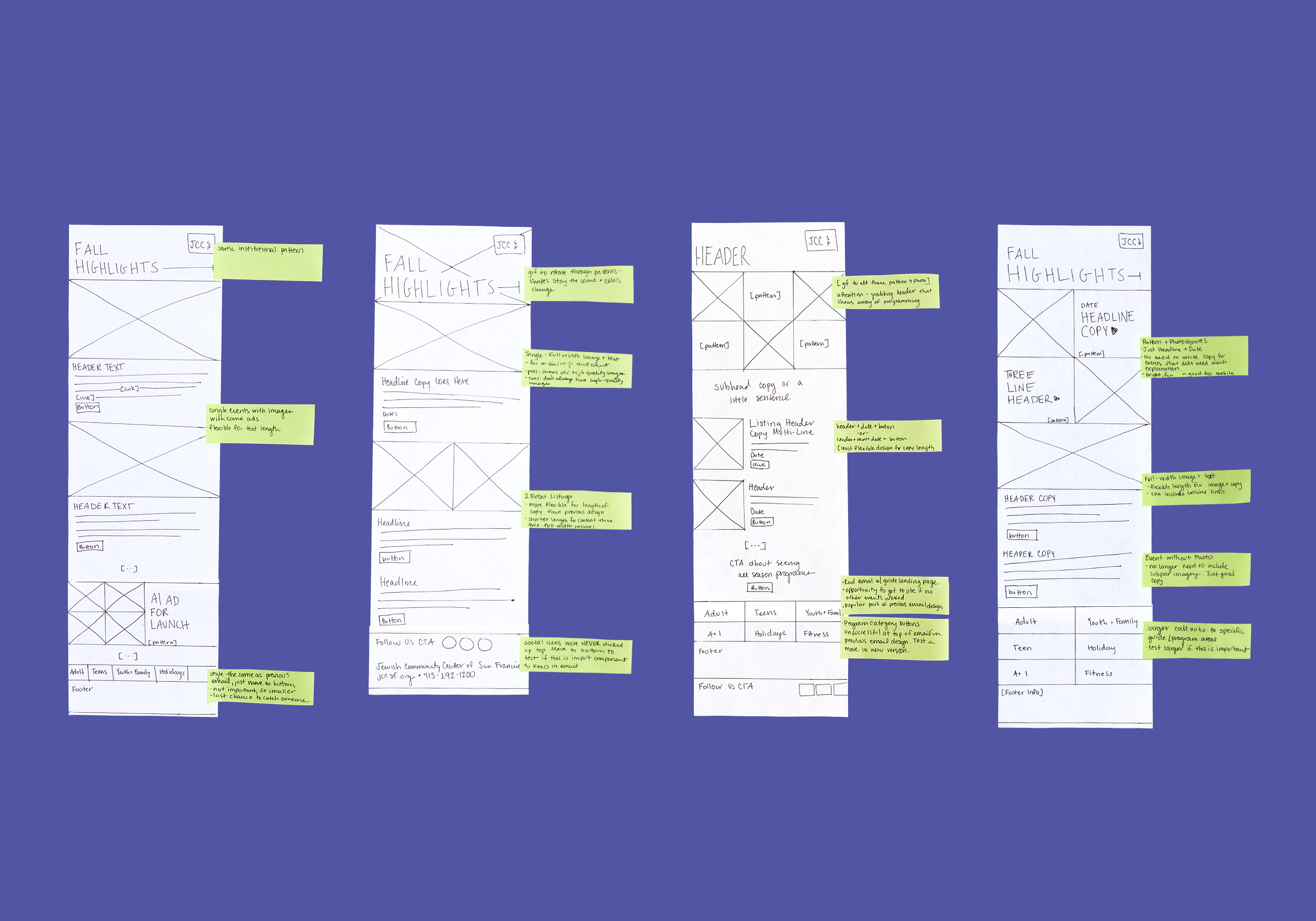
The new email template incorporates the new brand with a dynamic design. It’s built out of reusable components and accommodates a variety of content, making it easy to produce by the team.
Make it easy
Key clickable assets were strategically placed to maximize engagement.

Results
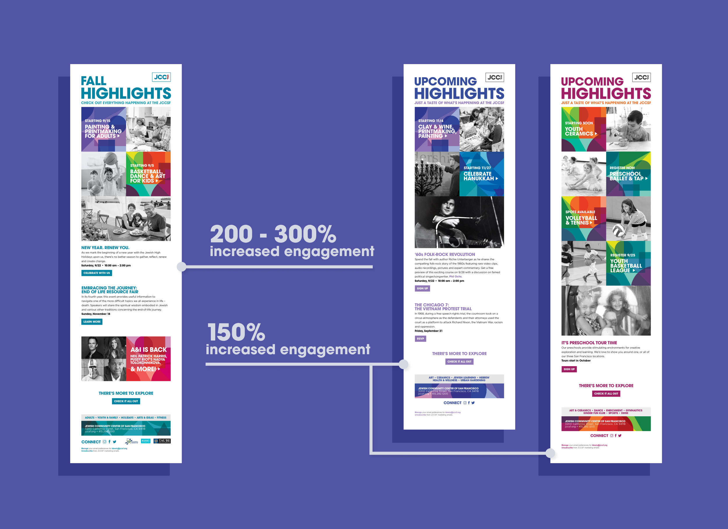
The season launch template saw a clickthrough improvement of 200-300%. Expanding this design to the adult/youth program emails brought 150% increased engagement.
That’s not all
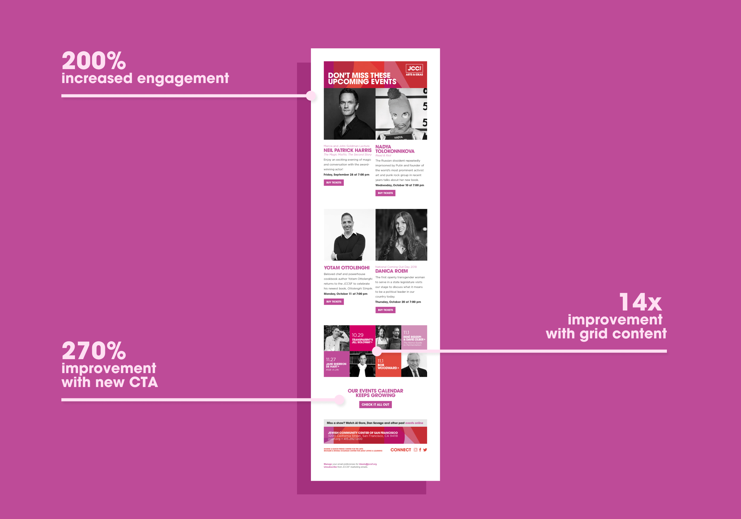
Next, taking the same approach to the Arts & Ideas biweekly newsletter, pivotal adjustments improved overall engagement by 200%.

