The Plan
My research focused on conducting interviews and a competitive analysis. It’s important for the Netflix watch party to outshine its competition – after all, it’s the number one streaming service in the world. My goal was to design an experience that feels as close as possible to in-person watch parties.
The Process
Research Focus areas
What do people enjoy about watching movies and tv shows together?
What ways can people remotely watch content together?
Are potential users interested in remote watch parties?
Market Research
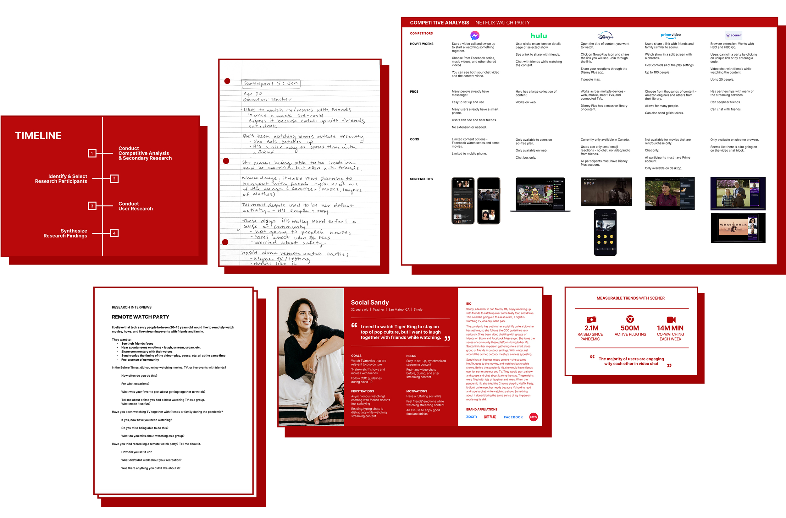
I studied the watch parties major streaming services provide to their customers, as well as Chrome plugins that market themselves as such. I noted how the service works, what features are included, and their strengths/weaknesses.
Interviews
To empathize with users, I reached out to five moderately tech savvy people, varied in age and gender, who enjoy watching tv shows or movies with friends. Due to the pandemic, all of these interviews were held remotely via Zoom.
Understanding the user & Finding Patterns
Now it’s time to synthesize the research while keeping a human-centered mindset. Using this data, I developed a persona to document high-level goals, frustrations, motivations, and needs.
Netflix Together Users:
• watch movies or shows with friends
• crave ways to enrich their social life
• enjoy video chatting
UX Challenges
Current Options Aren’t Cutting It
At the time of my interviews, streaming services only provide text chatting for watch parties, if they have a party feature at all. Many interviewees think typing and reading messages add “work” to the experience. On top of that, it is distracting from the video.
As an alternative, interviewees asynchronously watch shows with friends and text about them. This, too, doesn’t feel satisfying.
Watch Parties Are Social Events
Keyword: Social. Interviewees want to pause and discuss. They want to hate-watch with running commentary. Most importantly, they want to feel together – laughing, eating, drinking.
UX Opportunities
It’s safe to say that current watch party experiences aren’t providing users with the same warm fuzzy feelings that in-person watch parties do. Users don’t feel like they are actually with their friends.
In the Flow
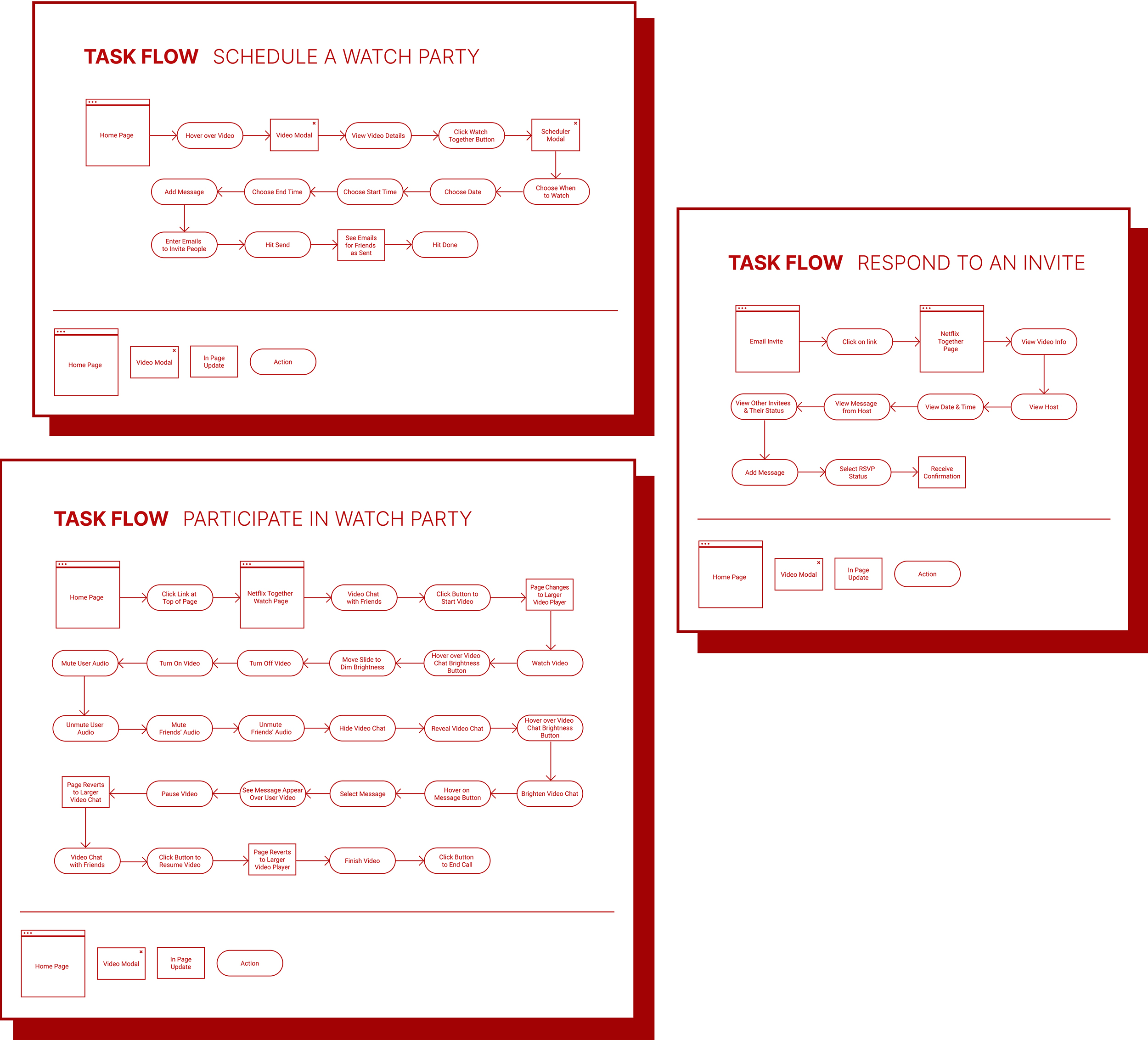
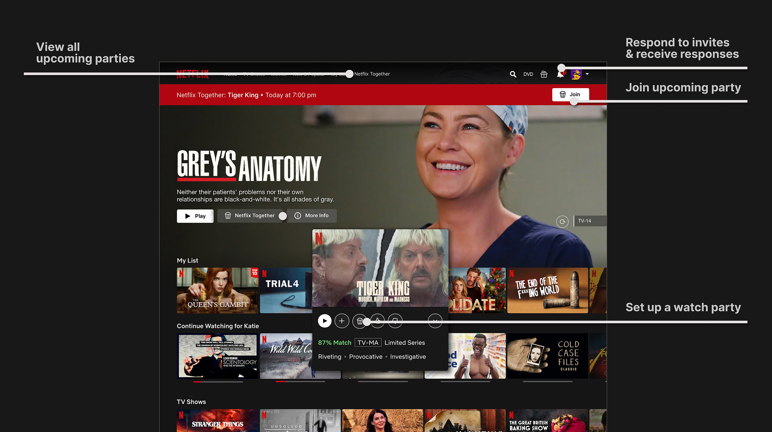
I started plotting out the Netflix Together experience with task flows – specifically for setting up a party, responding to an invite, and participating in a watch party. This task allowed me to understand what steps the users would take, as well as, begin to understand what features are needed.
Exploration
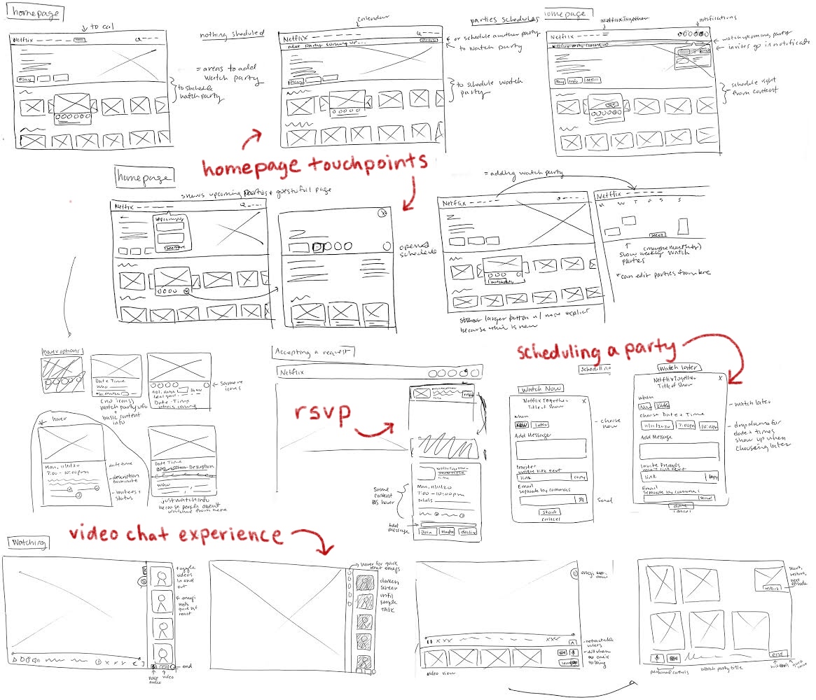
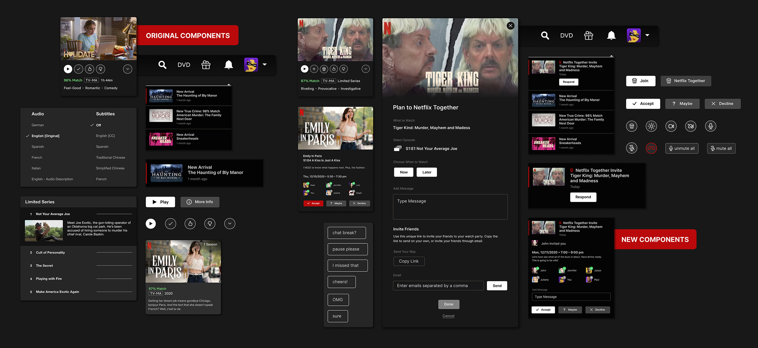
With the UX challenges in mind, I took pencil to paper and sketched out various ways Netflix Together could integrate into the current Netflix interface, as well as develop options for the new experiences. I used Netflix design patterns to analyse how to initiate the flows and align new components to the system.
Testing & Iteration
Option 1: Emoji Messages
Taking a note off of the popularity of Facebook Live videos, I created a limited chat where friends could quietly express emotions through a small group of emojis.
Option 2: Premade Messages + Emojis
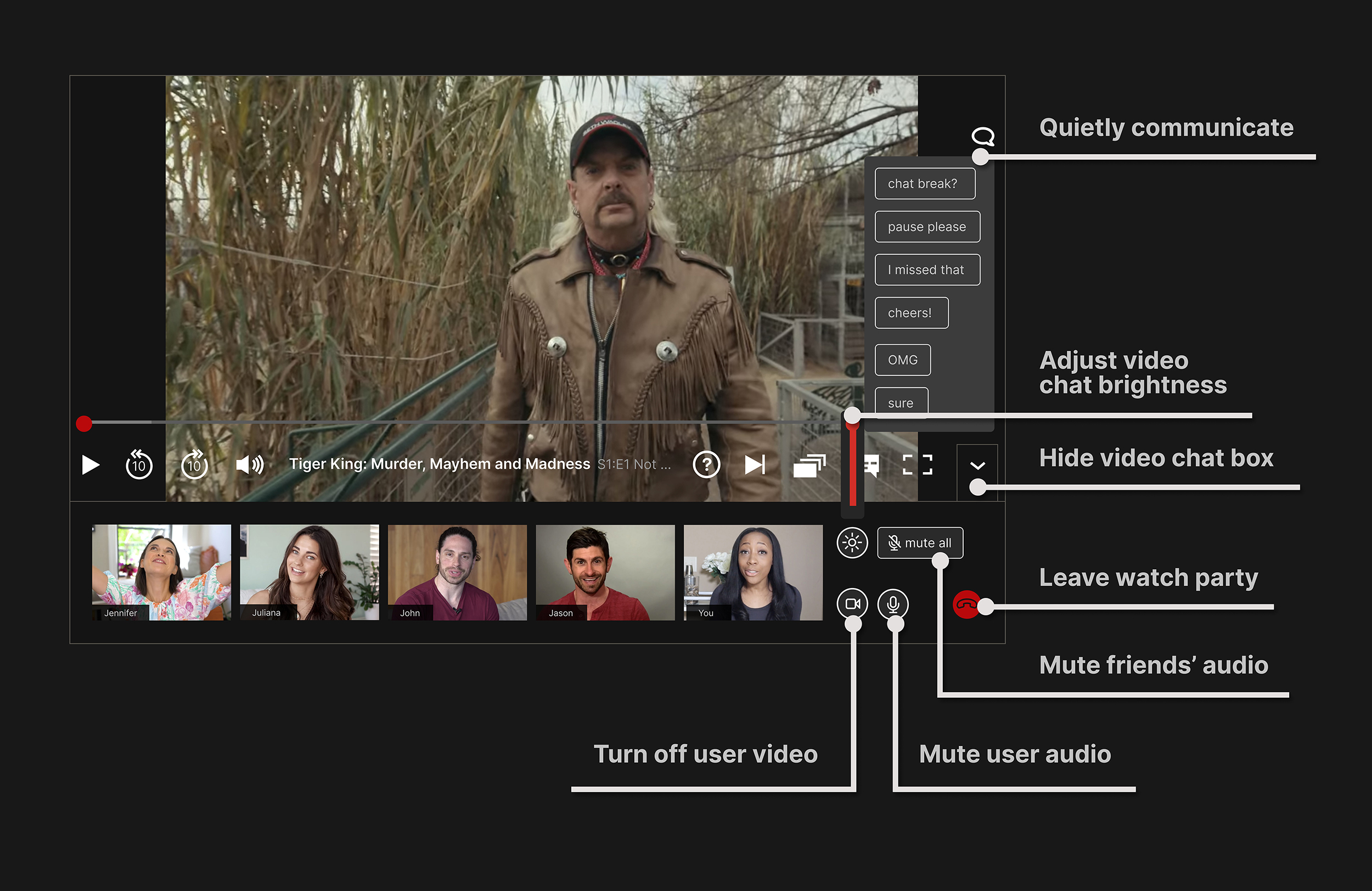
To add onto this, I developed a list of premade messages that users could share with each other. The idea sprung from wanting to pause – use the bathroom, discuss the theories, etc. – without disrupting the video.
Option 3: Full Chat
Since many of the streaming services provide full chat as an option for their watch parties, I decided to test to see if users would be interested in having access to this feature as well.
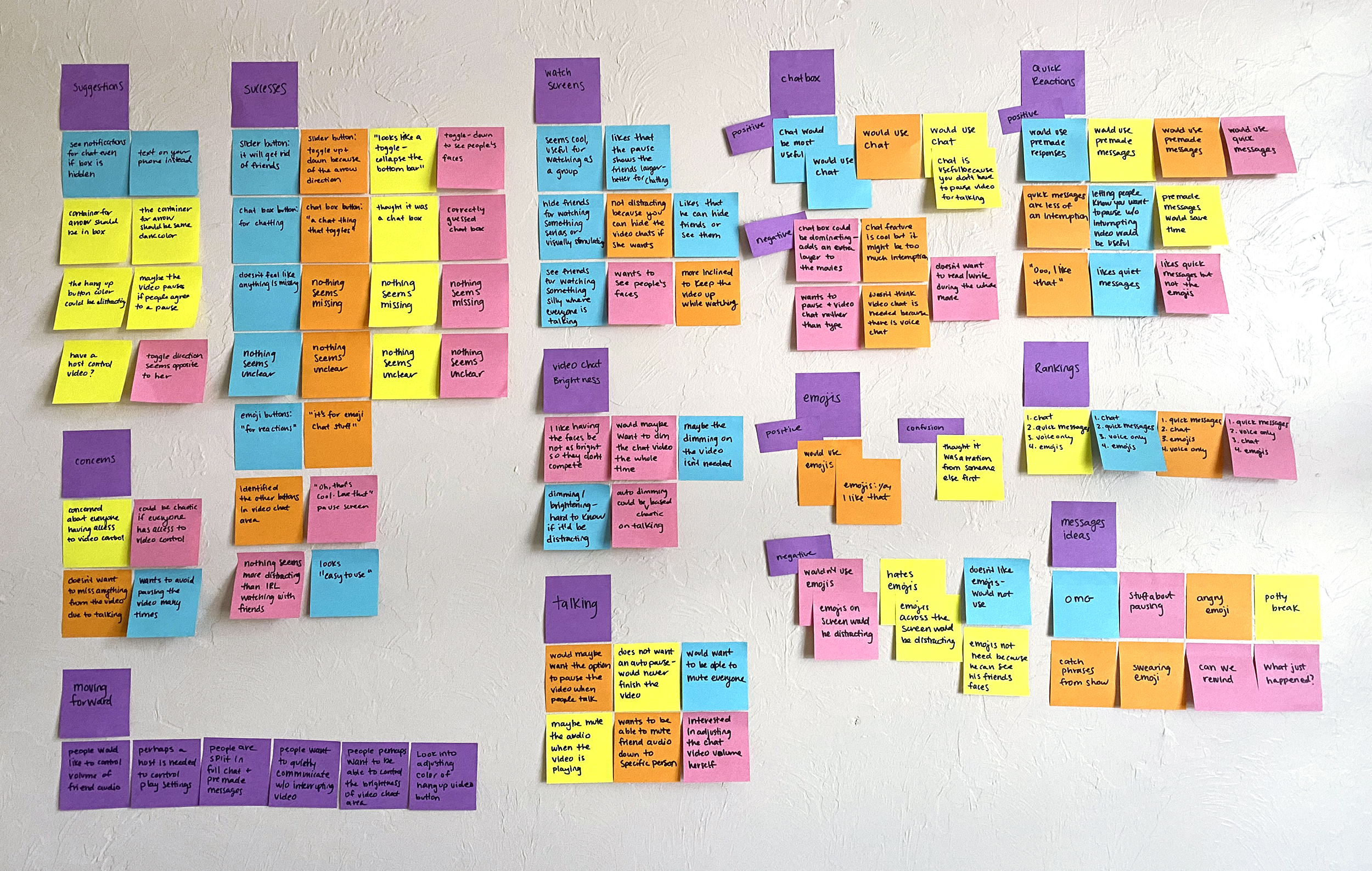
Affinity mapping the results from the testing to identify patterns
Results
The Solutions
Next Steps
A huge portion of watch parties is the food and drink. The next step I’d like to take is to see if there is a way to integrate a more shared experience in this arena… Maybe a partnership with a delivery service.


