The Plan
This project started with a lot of research – both competitive analysis and secondary research around achieving goals, healthy habits, and breast cancer risk reduction. Next up, talking to real women to gain additional insight on these subjects. My goal was to develop an app that guides women through developing healthy habits – nutritious eating, exercise, full night’s sleep, breast self-exams – all of which reduce the risk of cancer, including breast cancer.
The Process
Research Focus areas
Why are women not taking advantage of all preventive breast health activities?
How do women feel about a healthy lifestyle – exercising, eating well, and getting enough sleep?
What has helped women succeed in health-related goals? And what has interfered with success?
Secondary Research
This project started with a crash course on the state of breast cancer in the U.S. and how to reduce risk, followed by research into scientifically-backed methods to reach goals.
Market Research
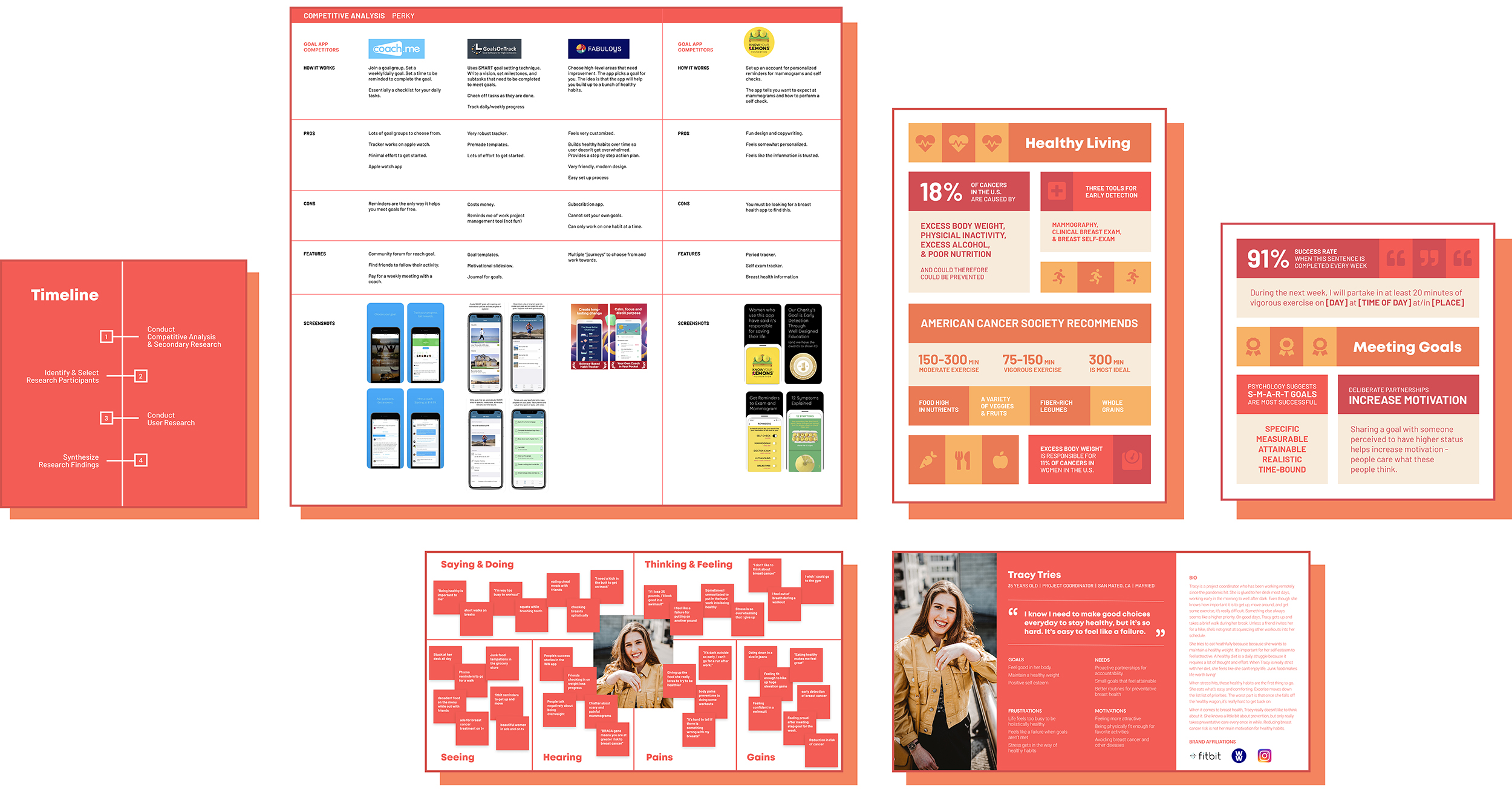
There are many goal tracking apps on the market and I aimed to learn what methods they use to guide users to success. For three prominent apps I noted how they work, the pros, the cons, and the features. I also studied the same in apps that focus on breast health.
Interviews
To empathize with a range of women, I reached out to five, all in different stages in their life. I asked about their struggles and successes in reaching health-related goals. We also chatted about the level of importance of eating healthfully, exercising, and sleeping plays in their life.
Understanding the user & Finding Patterns
Time to put it all together and uncover insights. I created an empathy map to document high-level behaviors, goals, frustrations, and influences. I channeled this into a persona – a document to guide solutions.
Target Audience
• Desire to build healthy habits
• Aspire to feel good in their body
• Need assistance in setting manageable goals
• Struggle to find success on their own
• Lack knowledge around preventative breast health
UX Challenges
Fear of Failure
Women know that setting health-related goals is important, but do not want to feel failure or embarrassment. Because of this, many don’t bother trying.
Healthy is Hard
There are obstacles everywhere – grocery shopping, work, stress, depression, pain, bad weather, social life… the list goes on. While women know that eating well and exercising are important, many struggle to implement these into their day or week – no matter where they fall on the healthy weight scale.
Derailed by Stress
Many interviewees note that stress can totally destroy their path to success. Weeks of progress go down the drain when people feel overwhelmed. Once off the path, it feels impossible to hop back on.
Prevention Isn’t Top of Mind
All women are familiar with breast cancer, but it’s not something they like to think about. Because of this, plus lack of awareness, women don’t have holistic preventative breast health routines.
UX Opportunities
It’s clear that women could use additional resources to live their best healthy life – from setting achievable goals to handling the hurdles life throws at them.
In the Flow
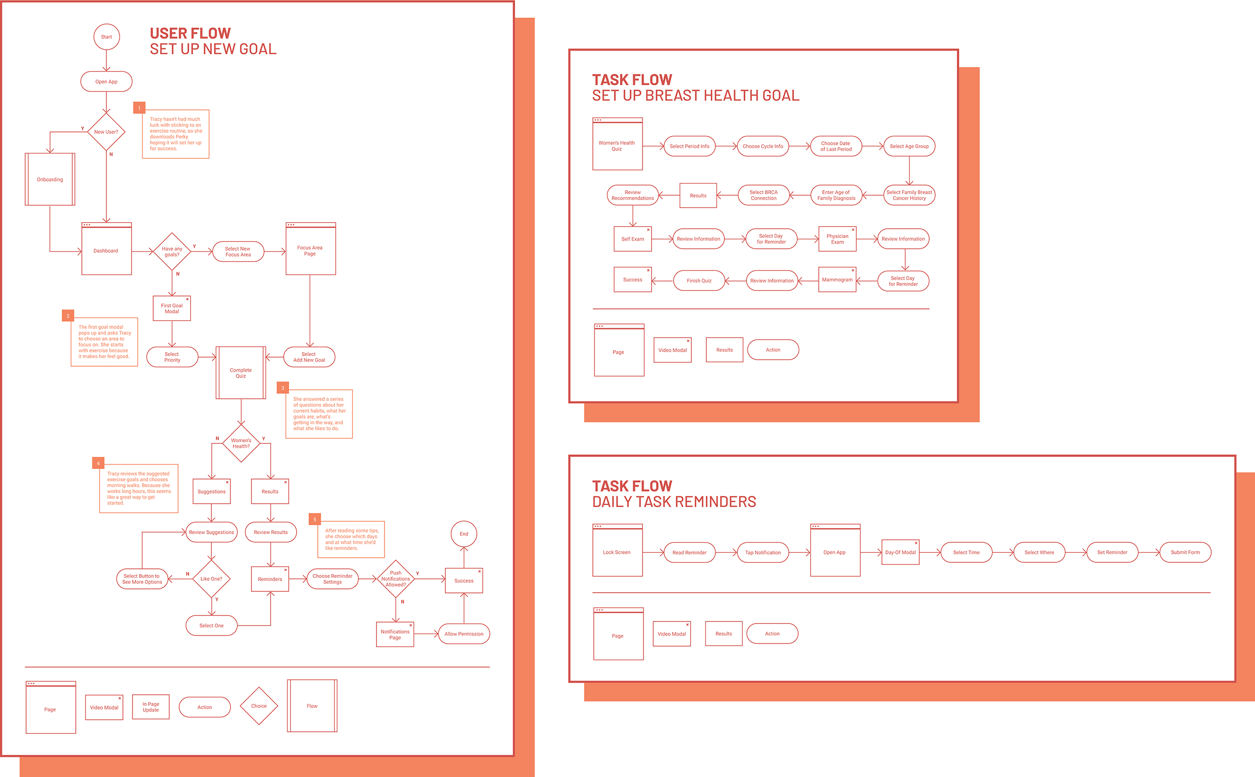
I started mapping out the Perky experience through flows – setting up different goals, achieving a goal, adding a friend, checking in, reviewing reports, among others. (Below are a few examples.) This helped me determine the best path to gather information from users to create a customized plan, as well as how to integrate science-based practices for meeting goals.
Exploration
Next up, sketching out the flows! Through sketches, I tested out multiple ways to set up the dashboard and move through the application – current tasks, overall goals, tips, check-ins, and partnering with a friend.

Refining the Vision
From here I moved on to mid-fidelity wireframes. It was time to make the process feel as real as possible. I focused on fleshing out both the UI and the content.

Testing & Iteration
Before spending time on beautiful mockups, I put the wireframe prototype in front of real women. It was important to test the ease of use of the overall app, as well as temperature-check the content to make sure it felt useful and relevant to users.
I chose the most essential takeaway tasks from testing to incorporate into version one of Perky. Those centered around decreasing the amount of effort the user needed to exert with both reading and writing. This was one of the biggest takeaways I took from this project on a personal level, as well. It’s clear that every step, screen, action, and sentence needs to help the user move quickly and easily through the experience. Anything less can lead to abandoning the app.
The Solutions
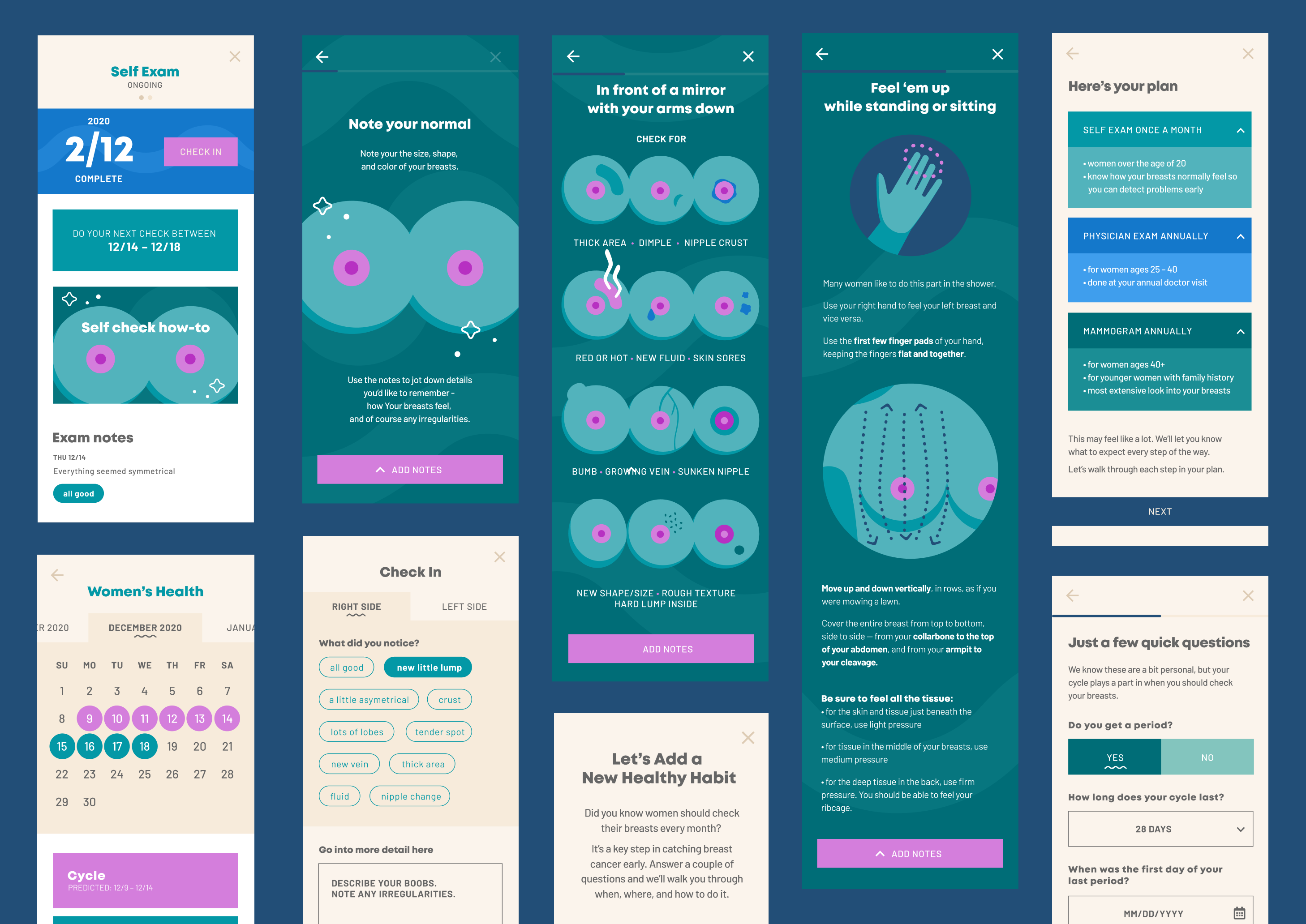
Perky holistically reduces breast cancer risk by helping women achieve health-related goals already at front-of-mind – getting more exercise or eating more healthfully – and then invites them to take control of their breast health.
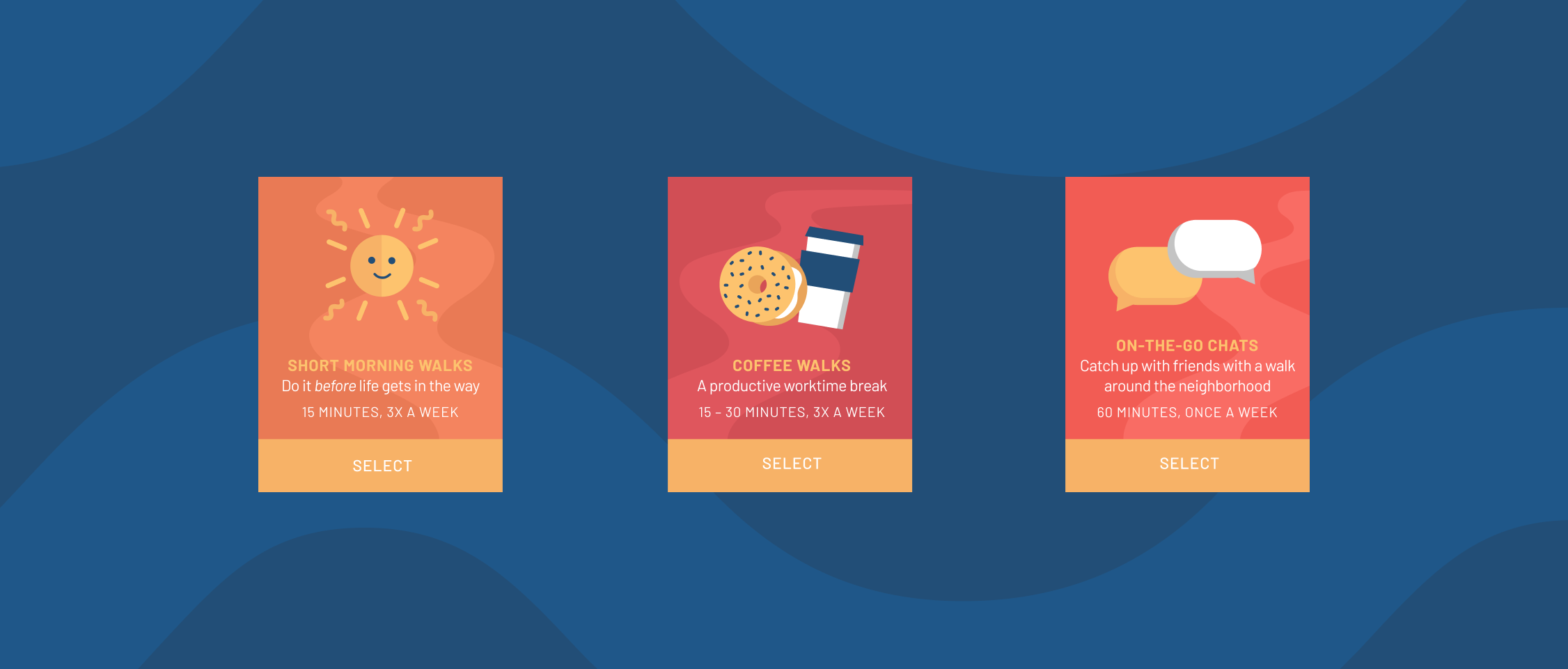
Power of Positivity
To round out the experience, the branding decisions bring a positive atmosphere to Perky. Women are strong, resilient, capable of tackling anything they set their mind to and the app wants to encourage this. The casual, non-judgemental language, cheerful imagery, and bright color palette convey, “You got this!” The tone replaces the healthcare-scaries with feeling empowered to take control of their health.


