The Brand
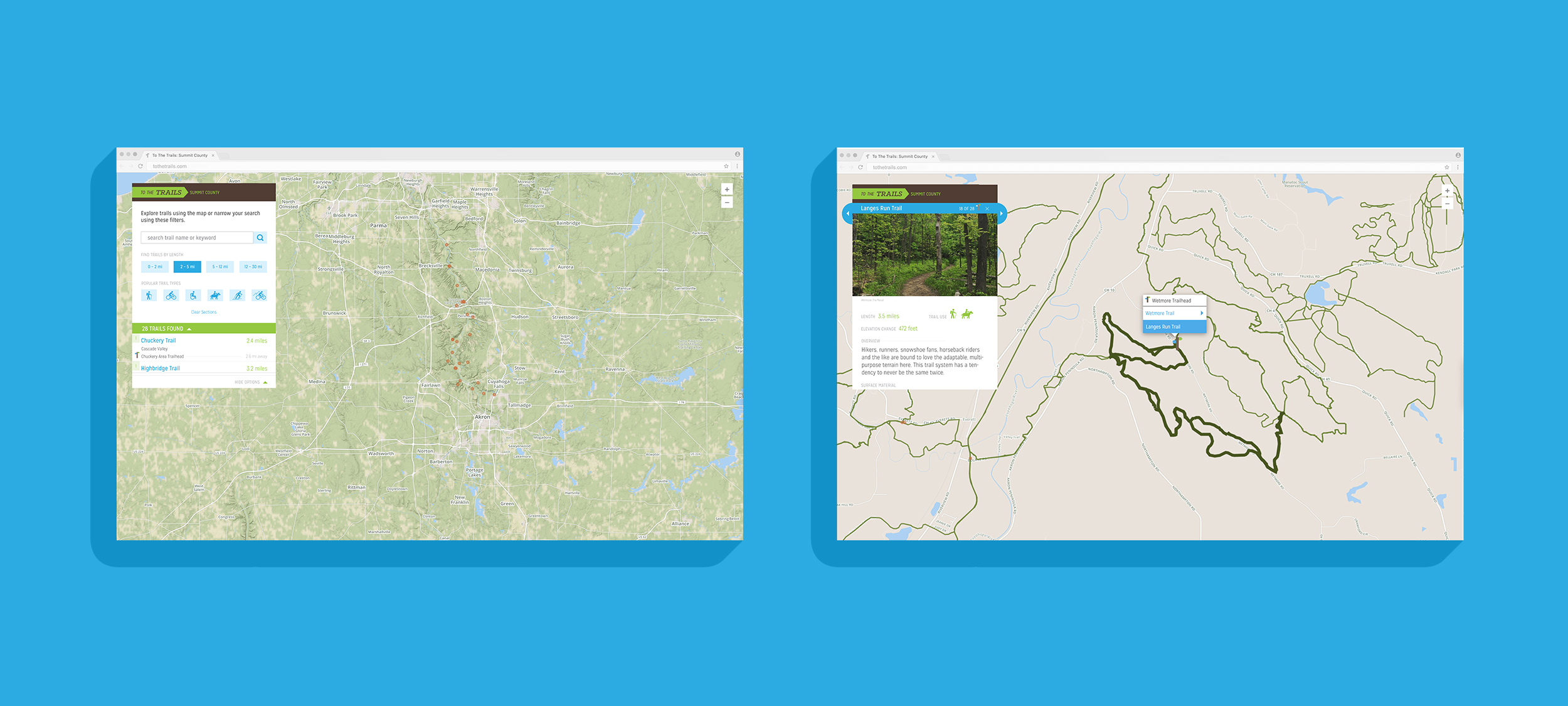
Influenced by the signage around national parks and forests, the visuals utilize a chocolatey brown and off-white paired with the vintage sign-inspired typeface Mission Gothic. A vibrant green and blue round out the earthy palette. The logo embodies the goal of To The Trails – exploring and wayfinding. The arrow represents a trail marker and a symbol of movement. Built from these arrows, even the trees express energy. To The Trails was developed as a Code for America fellowship project with Summit County, Ohio. We partnered with Cuyahoga Valley National Park and Summit County Metro Parks. Explore the beta.


